Wednesday 30 November 2016

Organisation: Photography Planning


Looking at example photography (above) I know that when it comes to taking photographs for my magazine by looking at 3,4 and 5 you can see the many different ways bands are positioned on the front cover of different magazines. 4 goes for a more “in your face” type of shot – usually taken from a low angle. 3 goes for more of a straight on shot with the lead singer at the front, and 5 goes for a wide angle shot with each member of the band on the same level – almost as though not one is more important than the other, however 5 again uses a low angle shot which shows the many ways a low angle shot can be effective.

1 and 2 are more suited to double page spreads or contents pages, this is because they are more designed to show the surroundings. These two images look like they are designed to portray the artist’s style and tone – for example, shot 1, of Green Day, has a warmer feel to it due to the warm, yellow lighting that has been used. Whereas shot 2 uses more cold, dull colours which portrays Linkin Park’s tone.

Tuesday 29 November 2016

Drafting and Planning: Remake - Remodel Self-Assessment


I presented our Remake-Remodel tasks to the group and explained the choices I made. Here is some of the critique I received:
  • Part of the wall behind the cover star has not been removed fully.
    • Furthermore, some areas are cropped dodgy
  • The red font face for “Red Hot Chili Peppers” has been lost in the dark clothing.
  • The “Plus” section is too small and could do with a few more cover lines – currently it looks out of place.
  • The cover stars are a little too big; they could do with being shrunk just a little bit as they dominate the masthead.


In the future, I will refer back to this task to help me when creating my real magazine. This task is useful for learning the software and making mistakes now so I don’t have to make them when making my real magazine.

Monday 28 November 2016

Research into Target Audience: Questionnaire Results

To get an idea of my target audience for my magazine, I created a questionnaire on SurveyMonkey.com. Here are my results:

Question 1 was “What is your age”. I asked this question to give me an idea of my target age range. From my results I can see that my target audience is 16-21 year olds. This information allows me to focus my attention on this age range when creating my magazine.

Question 2 was “What is your gender?” I asked this to grasp what the majority of my target audience’s gender was, allowing me to customize my magazine to suit their needs. From my results I can see that the majority of my target audience are female. Because of this I will have my magazine lean more towards a feminine feel, however to not exclude the other 30% of my audience, I will have to ensure my magazine isn’t too feminine.

Question 3 was “Do you listen to Alternative Rock?” from my research I know that 80% of my audience do listen to alternative rock, so this tells me that it is a good genre to make a magazine on.

Question 4 was “What colour scheme would you expect to see on an Alternative-Rock magazine?” from my research I know that 60% of my audience prefer the idea of a different colour scheme depending on the cover star. Because of this, I will need to ensure that my mast head is able to change colour to match the cover star. This will allow me to create symbiosis between my audience and my magazine.

Question 5 was “Should the magazine’s language be: Formal or informal?” 80 of my audience prefer informal language for music magazines. Because of this, I will use informal language when writing articles. However, I will also use formal language sometimes to account for the other 20%

Question 6 was “How frequent should an Alternative Rock magazine be published?” 60% of my audience suggested that a monthly magazine is best for my music magazine.

Question 7 was “What content would you expect to find in an alternative rock magazine?” from looking at the above results, I noticed that interviews, news, events, band information, etc. were all popular answers from my audience. Because of this, I will be sure to include these features.

Question 8 was “Should the magazine be advertised on social media?” 100% of my audience said yes to this question. This means that my magazine should have social media links on it.

Question 9 was “Should an online version of the magazine be available?” 100% of my audience replied “Yes” meaning that an online version of the magazine will be ideal; this will allow my magazine to not be made redundant in the future if paper magazines go out of fashion.

Question 10 was “How much would you be willing to spend on a magazine?” 9% said £3.50 - £5.00, 18% said under £2.50 and 73% said £2.50-£3.50. This tells me that people are more willing to spend a mid-range price for a magazine. This is the range that I will price my magazine.


Wednesday 23 November 2016

Drafting and Planning: Remake - Remodel Task


This was my response to a task set called “Remake – Remodel”, in which we had to use our own photography and our own cover star to make a realistic looking cover of an existing magazine.


For my remake – remodel I chose Rocksound as I am taking influence from them in my real magazine. I like that Rocksound don’t stick to one, rigid colour scheme and are not afraid to use vibrant in-your-face colours when it is useful, which is what I chose to do here. I was originally planning on having a simple house style, but this changed when I took my photographs and decided that this was more of a “fun” type of band. I took my photograph from a low angle to give the band some prominence on the cover; however I chose to have one of the artists to be crouched at the same level as the camera to give a sharp direct address. I feel it is this point that draws the eyes of the reader the most. I chose to use a light blue background to create some symbiosis with one of the members of the band, but to also contrast the red text. (Learn more about the contrast here: Here). The Rocksound masthead turned out to be black and white “fuzz” which was an accident when exporting the cover from PagePlus, however I liked the affect this gave the magazine – so I chose to keep it. Finally, with the anchorage text, I was struggling to find a location to position it where the text, no matter what colour it was, didn’t blend into the main image. To contrast this, I decided to use a background on the text to make it stand out.

Research into Similar Products: Other Magazine Styles


Even though this magazine does not fit my chosen genre of music or my magazine style, I like it for many reasons. The main reason I like it is the simplicity of the entire cover – it is not too much, yet not too little, it is just enough to get the point across. The mast head is kept as small as it can be, while still operating as an upper left-third masthead. This makes way for the main cover line to stand out, making it the core focus for the reader. The use of a simple colour scheme is also effective as all colours used are gradients of either black or white, meaning it is easy on the eyes to look at.


I think it will be useful for me to look back on this cover when I design my own magazine as I like the simplistic feel of it.

Tuesday 22 November 2016

Drafting and Planning: Cover Page Layout Draft

In preparation for creating my magazine, I decided to plan the layout I would like to use for my cover page. I’ve decided that I am going to use a skyline at the top of my cover to advertise posters. I will have secondary cover lines positioned in a bar on the  left hand side of the page, I want to do this to dedicate the main portion of the cover to my cover star, and to reduce clutter. This will mean that it will be easy for the readers to see who is featured without being overwhelmed by masses of text all over the cover. I will use the bottom right corner of my cover as an area for “Also Inside” for things like CD’s, games, quizzes, etc. My main image will take up ¾ of the page to ensure that it is the first thing the reader notices. Finally, my main cover line will be slanted slightly to make it seem more prominent. I will position my anchorage text at the bottom of my main cover line to draw the reader’s attention to the “Also Inside” box below it.


Monday 21 November 2016

Research into Similar Products: Band Names

To help me decide on a name for my cover star, I googled “Alternative Band Names”, this provided me with a link to a Wikipedia page that listed the names. From looking at the extensive list of names, I noticed the word “the” was a popular one – showing up on about 250 occasions, because of this, “T” was the most popular letter.
Some names that stood out to me on this list included:
  • ·        Faith No More
  • ·        Enter Shikari
  • ·        I Love You but I've Chosen Darkness
  • ·        Ima Robot

For more inspiration I visited “www.bandnamemaker.com” – a useful tool for creating rock, punk and other music genre names. Here’s some I found without using key words:
  • ·        Upon Humor
  • ·        Church Enterprise
  • ·        Unplugged Falcon
  • ·        Enter Abyss
  • ·        Void Society


I like the name “Enter Shikari” as it sounds strange and unknown, which gives it a sense of mystery. “Shikari” means “a hunter” which may connote to being hunted. The words “Enter” and “void” stood out to me on bandnamemaker.com and so I will use them to create the name of my cover star. To make the name more realistic, I will add “The” between both the words to sound like an edgy alternative rock band,


Enter the Void

Wednesday 16 November 2016

Research into Similar Products: Potential Colour Schemes


Red
When looking at “Alternative music magazines” I noticed the colour red showed up more than any other colour. Red is a god colour to use as part of a masthead or as something you wish to make stand out as it is a vibrant colour that catches the eye of the reader. Red brings text and images to the foreground, used as an ancient colour to stimulate quick decisions. The colour red has connotations with fire and blood. It is also associated with energy, danger, strength and power, as well as passion and love.
Red is a very emotion intense colour which suits the emotional section of the alternative genre.  

Pale Blue
On the colour wheel, the opposite (and therefore best accompanying colour) to red is Pale/Light Blue. The colour blue is associated with cold, damp and slow compared to Red. Therefore, the blue will sit as a background for the red’s vividness. While red has connotations with danger and energy blue is seen to be peaceful and cool. Because of this, the colour combination of blue and red will work well together.
Grey

Similar to blue, grey contrasts red. Grey is seen as a cool, neutral, emotionless colour. It is typically associated with dullness and dirty, but also as formal and sophisticated. Grey is also associated with loss or depression, which could link with the genre of the magazine.

Tuesday 15 November 2016

Research Into Similar Products: Cover stars

To get an idea for what my photography from my magazine should look like I looked for magazines of a similar genre to take inspiration from. As I am taking the majority of my inspiration from Rock Sound I decided to see how they present their cover stars. I found that the majority of their covers include an entire band as the main image, with the front man/woman at the front and the rest of the band behind him/her. When you look at the body language and facial expressions of the cover stars, every single cover star is making direct address with the reader.


All of the covers have one or more element of dark colours on them, this matched the “emo” side of the alternative genre, and in most cases it is the cover stars’ clothing that is black. From this I know that my cover stars should wear dark colours on the day I take the photographs for my magazine. Alternatively, I could ha have my cover stars wearing white or bright colours to contrast a black background.

Monday 14 November 2016

Drafting and Planning: Fonts


When looking for fonts for my masthead I wanted something simple but punchy to match the shortness of the name of my magazine. Because of this, many of my shortlisted masthead fonts are bold, blocky fonts with little to no exaggerated elements – with one exception, Adventurer Light SF. When I typed in one of the possible names for my magazine and saw how it looked in this font, I liked how the “u”, “r” and “e” were presented, I feel like it matched the meaning behind the word “Outre”.

With the body fonts, again I wanted a simplistic font that has little to no obvious features. I wanted this to not distract the reader from the rest of the magazine. My favorite out of the 5 I shortlisted was Century Gothic. I liked this one because while the others were quite bold, Century Gothic remained slender. I found that Century Gothic was the easiest to read for a long period of time because of this.

Tuesday 8 November 2016

Drafting and Planning: Possible Magazine Names

In preparation of making my real magazine, I want to decide my magazine name in advance so that I don’t waste time when it comes to making it.

For inspiration, I went to Google and searched “Alternative rock definition” and to which I found: “The definition of alternative rock is music outside of the mainstream that includes elements of various types of music including punk, heavy metal and folk music.” I like the idea of having subliminal messaging/meaning behind names for things like magazines, TV shows, etc. In response to this definition I went to www.thesaurus.com and searched “uncommon” (the opposite of mainstream). I looked through the list of Synonyms and one that stood out for me was “Outré” – the definition of which is “passing the bounds of what is usual or considered proper” which I feel almost matches the definition of “Alternative”

In a similar manner I found the word “Eccentric” which is the Greek word for out of centre. This could represent how the genre of alternative rock doesn’t follow uniform codes to define “alt-rock” as bands/artists in this genre don’t necessarily sound at all alike. For a name of a magazine I feel it is too long of a word so I could shorten it to “ECent” or something similar. This again will give the name of my magazine a subliminal message.
The word “Slant” is obviously when something that is in a direction other than horizontal or vertical, however the word “slant” also means to have a bias towards a particular topic. I feel this too could make for a great name for my magazine as it is a snappy word that also has the underlining subliminal message of “out of the ordinary”.

Other notable Possibilities:


  • ·        Idiosyncratic – from the Greek word idiosyncrasy meaning behaviour or way of thought peculiar to an individual. [Shorten to Diosync?]

Monday 7 November 2016

Research into Target Audience

For my magazine, I have chosen to get inspiration from Rock Sound magazine as I like their stylish approach on their covers – using a large amount of symbiosis within the colour scheme they use. Furthermore, each issue of Rock Sound (from what I have seen) is unique in the colour scheme they use. What I love about Rock Sound’s covers is they are not afraid to use vivid colours and then in the next issue use dark, gloomy colours – I feel like this keeps the reading experience fresh.


   This contrasts magazines such as Kerrang or Q who keep an almost rigid design and similar colour scheme. Furthermore, I feel like the front cover of Kerrang is too “in your face” with screamers and imagery all begging for your attention - something I find distracting and unpleasant when reading. One other thing I like about Rock Sound over Kerrang is that Rock Sound uses the entire band as the cover star, while Kerrang only uses the lead singer. I don’t personally like this as I feel it makes the other members of the band seem less important. Kerrang only featuring the Lead vocalist as caused some bad relations between the magazine, the band and ultimately the audience/fans of the bands. To avoid these bad relations, I will try to include a full band where possible.


Because I have chosen Rock Sound to be my inspiration for my magazine, it means that my target audience is made up of 59% females, and 72% 15-21 year olds. Because my target audience is majorically female, I will be more likely to use a male cover star and use bright house colours, however I don’t want to exclude males from wanting to purchase the magazine so I need to find the right balance. Furthermore, as my target audience are mainly made up of 15-21 year olds, I will use lots of imagery within my magazine, and few large bodies of text, as 15-21 year olds are less likely to enjoy reading long articles. Also, because my magazine will be aimed at a young audience, whom may have little to no income, my magazine should be priced reasonably enough that I would benefit as well as the audience – a good price generally is £3.00-£4.50 as anything over £4.50 will most likely be too expensive for my target audience, while a price lower than £3.00 may give off the impression that the magazine is cheap (in terms of quality).

Sunday 6 November 2016

Drafting and Planning: Research Into My Magazine Genre

For my music magazine I have chosen to do Alternative/rock music. 

Alt-Rock emerged from the independent music underground of the 1980s and became popular in the 1990s and 2000s. The term “Alternative” highlights the sub-genre’s distinction from mainstream rock music. Alternative rock music has stylistic origins from the likes of Punk-Rock, Post-Punk Rock, New wave and Hardcore Punk – meaning it is a hybrid of Punk and Rock music. Alternative rock bands tend to consist of a vocalist, electric guitarist, bass guitarist and a drummer.
The Alternative-Rock genre emerged in the UK in the 1980s with a Manchester band – “The Smiths” – being the most notable of the time.

The alternative-rock genre lost its popularity in the 1990s following the death of Nirvana’s lead singer Kurt Cobain in 1994 and Pearl Jam’s lawsuit against concert venue promoter Ticketmaster, which in effect barred the band from performing in most of the major venues around the United States, in addition to the fall in the number of grunge bands and the Hiatus of the popular alternative-rock Lollapalooza festival

However, during the late 1990s early 2000s alternative rock bands emerged including the likes of “The Strokes” and “The Rapture” - which took inspiration from the post-punk and new wave establishing the Pop- Punk revival movement. Preceded by the success of bands like “The Strokes”, an influx of new alternative rock bands emerged on the scene. Owing to the success of these bands, Entertainment Weekly declared in 2004, "After almost a decade of domination by rap-rock and nu-metal bands, mainstream alt-rock is finally good again.”

Well known Alt-Rock Bands:
·        Red Hot Chili Peppers
·        Nirvana
·        Twenty One Pilots (TØP)
·        Green Day
·        Radiohead
·        Foo Fighters
·        R.E.M
·        Linkin Park
·        Blink-182
·        My Chemical Romance (MCR)
·        & many more


Friday 4 November 2016

Drafting and Planning: Page Plus Exercise

In preparation for creating our own magazine, we were tasked with creating a mock-magazine using a piece of publisher software called “PagePlus”. Within this program we could import pictures from the internet to create a realistic-looking magazine. On our magazine’s front cover we had to include; a masthead, the issue date, the issue number, a URL, a barcode and a main cover line and accompanying main image, as well as some secondary cover lines. We also had to create a contents page and a double page spread. I tried to keep my magazine consistent throughout to keep a sense of realism. To do this I used the same colour scheme throughout as well as using the same cover star on each of the 3 elements. Furthermore, to keep the magazine consistent I ensured the page number I displayed on the contents page for my double page spread is identical on the actual double page spread.


This task is useful for me as when I start to create my real magazine I will be familiar with the software that I am using which will allow me to complete it in a more efficient manner and I will know how to do all the things I need to do in order to achieve realism with my magazine.
Thursday 3 November 2016

Drafting and Planning: Layout Task Self-Assessment

(The following is my self-assessment of my layout experimentation task which can be found here)

What Went Well?
  • I have justified most of my reasoning behind the decisions I made when I created the front covers.
  • I have included all but one of the codes and conventions of music magazines on all my covers (URL, Price and issue number – I forgot about the date line).
  • Most of the artists I used for my cover lines matched each other in terms of their genre and style of music.
  • In my opinion, my “Music_X” magazine was the best as it includes secondary imagery. This magazine was also the most fun to create.
Even better if:
  • I should have included he date line to give a sense of realism to the covers.
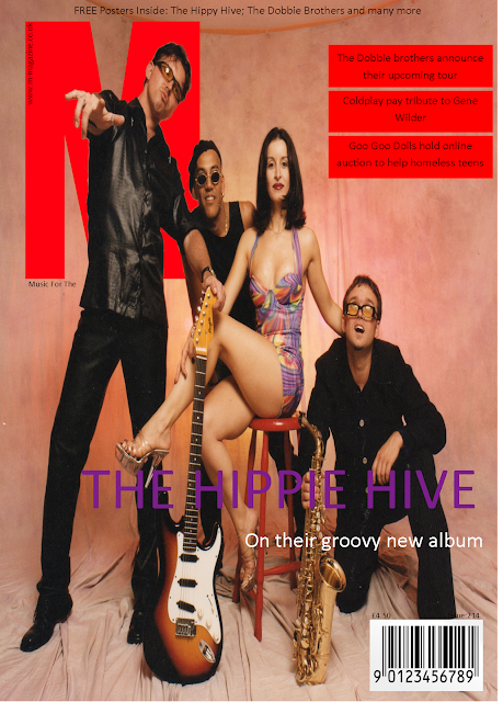
  • At times (for example on the cover of “M” magazine featuring “The Hippy Hive”) I could have used a more interesting font to match the artist’s style of music.
  • On the other cover of “M” magazine my main cover line of “Drake” blended in to the main image making it hard to read from a distance. I could have fixed this by either moving the cover line to a different location on the cover, or I could have chosen a different font or font colour.

This task was useful for me as in the future, when it comes to creating our real magazine, I can look back at this task and I can see what colours work together, what fonts work for what genre, etc. I think because of this task, the process of creating my magazine will be much smoother.

Wednesday 2 November 2016

Drafting and Planning: Layout Task

To practice layout designs we had to lay out the main cover line, and 3 other cover lines of 5 different magazine covers. When it comes to making our real magazines, it will be useful to come back and see what I do and don’t like in terms of layout and colour scheme, and will help me to create a nice looking final piece.


For this magazine cover – featuring “The Hippy Hive” I chose to use a purple colour font for the main cover line to create symbiosis as the female member of the band in the centre of the image is wearing a purple dress. I used two layers for the main cover line, as I used white for the second part. This was to separate both parts of the cover line as I want to grab the reader’s attention using the name of the band. I also put the secondary cover lines in red boxes to match the colour scheme of the magazine. Finally, I used a skyline puff to encourage the reader to buy the magazine.


Similarly with this cover I used a font that matched the gold colour on drake’s shirt to create symbiosis with the artist and the magazine. I like the font I used as I feel it matches a “street” or “urban” artist – like drake. However, I feel as though the colour or the positioning meant that it doesn’t stand out at a first glance, which could be improved by simply moving the cover line, or by changing the colour. I used the same design for the secondary cover lines to create a sense of continuity between both “M” magazines.


 With this cover, I used a bold white font to match the bold white colour coming from Marilyn’s face – therefore creating symbiosis. I also used a similar font, but in a different colour for the secondary cover lines. I used a similar colour to the masthead to create a sense of continuity and formality. I feel as though I could possibly have chosen a better font as from a distance it is hard to clearly read the text.


I found this magazine cover especially hard as I wanted to match the font of the Kings of Leon logo; however by doing this I find at a quick glance it is hard to see what the main cover line says (“Walls”). Due to there being a lack of negative space to put the secondary cover lines I found it looked the best to put them in “bubbles” across the main image. I used simple fonts in a white colour. I did this to make them stand out less even though they are quite obviously there with the big red circles around them. I chose to put the artist/bands name in sentence case, and put the topic of their feature in capitals. I feel this enabled it to look a small bit more professional


I found this magazine the most fun to make as once I had found Björk’s logo and saw it had a purple theme to it I decided the purple looked nice against the black background. Because of this I used the colour purple as the colour for my secondary cover line boxes. At first I had the secondary cover lines set out like on the “M” magazines, however I found this too repetitive and wanted to try something different, so I chose to retrieve secondary images of the other artists featured in the magazine, and put the secondary images alongside the cover lines. I feel as though that added a great look to the cover.