To practice layout designs we had to lay out the
main cover line, and 3 other cover lines of 5 different magazine covers. When it
comes to making our real magazines, it will be useful to come back and see what
I do and don’t like in terms of layout and colour scheme, and will help me to
create a nice looking final piece.
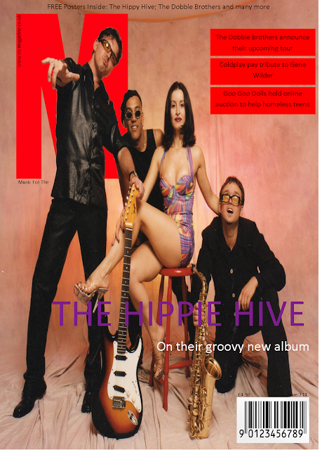
For this magazine cover – featuring “The Hippy Hive”
I chose to use a purple colour font for the main cover line to create symbiosis
as the female member of the band in the centre of the image is wearing a purple
dress. I used two layers for the main cover line, as I used white for the
second part. This was to separate both parts of the cover line as I want to
grab the reader’s attention using the name of the band. I also put the
secondary cover lines in red boxes to match the colour scheme of the magazine. Finally,
I used a skyline puff to encourage the reader to buy the magazine.
Similarly with this cover I used a font that matched
the gold colour on drake’s shirt to create symbiosis with the artist and the
magazine. I like the font I used as I feel it matches a “street” or “urban”
artist – like drake. However, I feel as though the colour or the positioning
meant that it doesn’t stand out at a first glance, which could be improved by
simply moving the cover line, or by changing the colour. I used the same design
for the secondary cover lines to create a sense of continuity between both “M”
magazines.
With this cover, I used a bold white font to match
the bold white colour coming from Marilyn’s face – therefore creating
symbiosis. I also used a similar font, but in a different colour for the
secondary cover lines. I used a similar colour to the masthead to create a
sense of continuity and formality. I feel as though I could possibly have
chosen a better font as from a distance it is hard to clearly read the text.
I found this magazine cover especially hard as I wanted
to match the font of the Kings of Leon logo; however by doing this I find at a
quick glance it is hard to see what the main cover line says (“Walls”). Due to
there being a lack of negative space to put the secondary cover lines I found
it looked the best to put them in “bubbles” across the main image. I used
simple fonts in a white colour. I did this to make them stand out less even
though they are quite obviously there with the big red circles around them. I chose
to put the artist/bands name in sentence case, and put the topic of their
feature in capitals. I feel this enabled it to look a small bit more professional
I found this magazine the most fun to make as once I
had found Björk’s
logo and saw it had a purple theme to it I decided the purple looked nice against
the black background. Because of this I used the colour purple as the colour
for my secondary cover line boxes. At first I had the secondary cover lines set
out like on the “M” magazines, however I found this too repetitive and wanted
to try something different, so I chose to retrieve secondary images of the
other artists featured in the magazine, and put the secondary images alongside
the cover lines. I feel as though that added a great look to the cover.


No comments:
Post a Comment