Wednesday 19 October 2016

Research into Similar Products (Vive Le Rock Issue 39)

Cover Page


In the above image I have highlighted the key features used on the cover of Vive Le Rock, issue 39. As you can see, Vive Le Rock follows many of the codes and conventions of music magazines within this genre. Vive Le Rock tended to feature older rock bands that have been on the scene for a long time.

Contents Page


This contents page was a simple contents page with nothing much on it. However, from the fact that there is only a title for “regular” features we get the feeling that this magazine has a long standing audience and doesn’t get that many new people, so they only actively advertise the regular features because that may be what their target market wants. This contents page includes images of 2 double page spreads that are in the magazine as a preview of what to expect from the magazine.

Double Page Spread


In the above image I have highlighted the key features of a double page spread in Vive Le Rock, issue 39. As you can see, Vive Le Rock follows the codes and conventions of a music magazine within the rock genre. The main image takes up the entire double page spread, and “morphs” the body of text around it. This gives the sense that the cover star is more important than the body of text. Because the photography takes up the whole double page spread, it is impossible not to miss it. Furthermore, symbiosis is created between the band and the magazine’s brand as the letter “O” in the title is replaced with The Mission’s logo. This symbiosis is further developed through the use of pink – the band’s colour. 

Tuesday 18 October 2016

Research into Similar Products (Terrorizer Magazine Issue 217)

Cover Page


In the above image I have highlighted the key features of Terrorizer magazine, issue 275. As you can see, Terrorizer magazine follows many of the key features of a music magazine in this genre. Terrorizer magazine is more hard core rock than the other magazines I have analysed, however I wanted to ensure a good variety of magazines within the alt/rock genre.

Contents Page


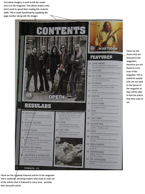
The contents page of Terrorizer has quite a simplistic design which is effective in what it does. The contents page includes the regular articles, which appear on many, if not, all issues of Terrorizer. These are usefully segregated from the other features as returning readers may prefer to be able to just be able to skip to them without having to read through the other features.
This contents page also includes secondary imagery that accompanies the contents tables. These images are paired with page numbers to help readers navigate to that page.

Double Page Spread


In the above image I have highlighted the key features of one of the double page spreads in Terrorizer magazine, issue 217. As you can see, the main image of the double page spread takes up both pages. This is because the darkness of the image was placed across both pages and the empty dark space was used as a background for the body of text. This is effective because of the white font colour used for the body of text.

The use of anchorage text at the end of the page acts as a break in the flow of the text and gives the reader a short rest before continuing reading. This prevents the reader from becoming bored.

Monday 17 October 2016

Research Into Similar Products (Rock Sound Magazine, Issue 219)

Cover Page


In the above image I have highlighted the key features of the cover of RockSound magazine, issue 219. As you can see the magazine follows the codes and conventions of a music magazine in this genre. RockSound used blue as a house colour as it creates symbiosis between the band and the magazine brand. This house colour is used throughout the cover. RockSound also include an “Also inside” section on the cover which only features the names of other artists in the magazine and not a short description of the story. This keeps the focus on the main cover line.

Contents Page


This issues contents page follows the same structure as other RockSound magazines. As you can see, 3 double page spreads have been selected and displayed on the contents page. These double page spreads have been linked to the contents table by a faint blue line which allows the readers to see the page number that the reader can find the double page spread.

Double Page Spread


In the above image I have highlighted the key features found on one of the double page spreads in issue 218 of RockSound. As you can see, RockSound include anchorage text as a short introduction to the feature. In the imagery, the cover stars are not making direct address. This could symbolise that Green Day are so well known they don’t need to convince the reader to read the feature.

Sunday 16 October 2016

Research Into Similar Products (Kerrang Magazine, Issue 1641)

Cover Page


In the above image I have highlighted the key features found on the cover of Kerrang, Issue K!1641. As you can see, the cover page follows many of the codes and conventions of a music magazine in this genre. One thing that stands out on this cover is the skyline, this skyline shows a continuation from the previous issue (K!1640) where the cover star was Green Day, and within the editor announced that the story was going to be covered in more than one issue.

Contents Page
In the above image I have highlighted the key features of the contents page of Kerrang, issue K!1641. As you can see, this contents page follows the codes and conventions that this genre have. This contents page includes the use of a puff, or a free gift, in the form of the 6 posters. This will encourage the reader to buy the magazine for the added value that these posters bring.


Double Page Spread

In the above image I have highlighted the key features of a double page spread of Kerrang, issue K!1641. As you can see, the double page spread follows the codes and conventions of a music magazine – despite the fact that it is a special edition double page spread. The use of the different colour text boxes secludes each separate “story” which shows a change in topic/subject. This enables the reader to feel as though there is not much to read despite the fact it looks a lot.


Wednesday 12 October 2016

Research Into Similar Products (Q Magazine)

Cover Page

In the above image I have highlighted the key features found on the cover of Q magazine, November 2016 issue. This issue was a “comebacks of the year” special edition which features Kings of Leon. As you can see, Q follows many of the codes and conventions of rock magazines codes and conventions, including; Left-third masthead, cover lines and pugs & puffs, which are used to advertise “free” gifts or added extras. These encourage the reader to buy the magazine as they feel as though they are getting more for their money.

Contents Page


In the above image, I have highlighted the key features of a contents page used in Q magazine, November 2016 issue. As you can see, the contents page of Q magazine follows most of the codes and conventions of contents pages of magazines in the same genre. On this particular contents page, the cover star is not visible through an image; this may be to encourage the reader to purchase the magazine to read more than one article, as if readers did only want to read one article they may be able to read it in the store without purchasing the magazine.

Double Page Spread


In the above image I have highlighted the key features of a double page spread in Q magazine, November 2016 issue. On this double page spread, the main image is plastered along the top of the double page, this is effective as it is the first thing the reader notices and is impossible to miss. Q has made the change in topic of conversation absolutely clear with the large, bold letter at the beginning of the paragraph. This prevents the reader from becoming bored of reading the article as they know where the next topic starts – therefore it feels like the reader has to read less. Furthermore, the use of anchorage text on the page creates a break in the flow of the article. This too prevents the reader feeling overwhelmed with the amount of text, which is useful in cases, like this one, where there are multi-page features.

Tuesday 11 October 2016

Research Into Similar Products (Rock Sound Magazine)

Cover Page


In the above image I have highlighted the key features of the cover of Rock Sound, issue 218. As you can see, this issue of Rock Sound is a special edition – an issue dedicated to My Chemical Romance’s album 10th anniversary. Because of this the entire font cover follows a similar colour scheme to the outfits worn by MCR. Furthermore, the use of gold typography gives a sense of triumph for the band as their record has reached the age of 10 and is still one of the most iconic and well known albums in the genre. The colour gold also provides added value allowing them to charge more for the overall quality of the magazine.
Even though it is a special edition of Rock Sound, the magazine still follows the codes and conventions of a music magazine in this genre. These codes and conventions include; a skyline – this is useful for advertising the magazine if it is stacked one above the other, rather than one next to the other. This partnered with the left-third masthead enables Rock Sound to ensure they are always seen, therefore possibly increasing sales. Pugs and Puffs are also used to give the reader more incentive to buy the magazine, for things like “free” posters and a “free” CD.

Contents Page


In the above photograph I have highlighted the key features found on the contents page of Rock Sound issue 218. As you can see, the contents page follows the codes and conventions of an Alt/Rock magazine loosely. One immediate and obvious difference between this magazine and others of the same genre is that the cover star does not take up a large portion of the contents page with a single large photograph. The main image has been replaced with 3 secondary images, one of which features the cover star. I believe this was done because this issue, while being a special edition of Rock Sound, features stories and articles form many other bands – some of whom have their double page spreads have been photographed and placed above the main featured story. If you look closely at the 3 double page spreads that have been used, you will notice a pattern, the first image is a light and bubbly image that is welcoming. The second image down is somewhat a deep blue which could symbolise a deep though process – which matches the imagery used. Finally, you have the image of My Chemical Romance (MCR) which is dark and gloomy. Looking at these 3 contrasting images creates a sense of build-up, especially because readers tend to read from top to bottom.

Double Page Spread


In the above image, I have highlighted the key features found on one of many Double Page Spreads found in Rock Sound, issue 218. Because this issue is a special edition tribute magazine for MCR’s The Black Parade record, there were many double page spreads used in this magazine. The reason I picked this one to analyse was solely down to the Photography. The image creates symbiosis with the brand and the house colour of this issue through their clothing. Furthermore, some may argue that the lighting in the background of the image also contributes to the symbiosis, as on the front cover, gold is used as the main cover lines typography colour.

Also, the use of the anchorage text is effective at creating a break between the multiple-page story; preventing the reader becoming bored. The use of the white typography that does not follow strict font lines (i.e. is a “wavy” font) contrasts the very uniform look of the rest of the double page spread.

Monday 10 October 2016

Research Into Similar Products (Kerrang Magazine, Issue 1640)

Before I begin to create my music magazine, I must research into products similar to mine (i.e. Alternative- Rock Music Magazines). For my first magazine, I chose to analyse Kerrang Magazine.

Contents Page
As you can see above, I have highlighted the key features of issue K!1640 (8th October 16). On the front cover, the cover star is Green Day. The use of “World Exclusive” in the cover line gives the sense of Uniqueness, and that this story could not be found in any other magazine. When the reader sees this, they will be encouraged to pick up the magazine and see what the exclusive is. Furthermore, the sub-cover line says “but why do they want to destroy pop-punk” which entices the reader further as it gets the reader thinking about all the possible reasons why, but they may be encouraged to buy the magazine to find out why. Kerrang use Pugs and Puffs to add extra value to the magazine. This allows them to charge a little bit extra because they offer so many “extras”. Kerrang use Cover lines and secondary imagery to display what else is featured in the magazine. However, because the secondary images are smaller than the main image, we get the sense that these stories are less important than the Green Day story.

Contents Page

In the above image, I have highlighted the key features of the contents page of K!1640. As you can see, Green Day – the cover stars – are not present on this contents page. I suspect that this is because Green Day will be appearing on the next issue of Kerrang as well as this one (as stated by the editor in the editor’s note – top right of the page). The contents of the magazine have been split into 6 sub sections, which each of the stories fit into. These sub sections include the regular columns/articles, as well as other regular – yet separate – sections like “Gigs” and “Reviews” which seem to appear on most, if not all issues. Then there is the “Features” sub section which is the articles that only appear on this issue and are focused on in this issue. Also, the editor’s notes in the top right of the page adds a personal feeling to the whole magazine, almost creating a sense of community. This may be to encourage readers to pick up the next issue of Kerrang.

Double Page Spread


In the above image, I have highlighted the key features of the Double page spread about Green Day in Kerrang Issue K!1640. This is one of many double page spreads on this particular story. As you can see, the main image takes up most of the spread, making it impossible to miss. Kerrang used anchorage text in the centre of the body of text with the text wrapping around it. This particular anchorage text is effective because it speaks about a topic that is commonly seen in the media - outside of the music world. This brings an element of seriousness to the article. Furthermore, the smaller body of text in the bottom right of the main body of text is effective because it stands out, as it is on a pink background while the other text is on white. This is ideally placed as it provides a break in the middle of the article as the story continues on the next page. This discourages the reader from stopping reading. 

Thursday 6 October 2016

Preliminary Task


Drafting & Planning: Investigating Typography

As part of the planning stage, we looked at a magazine with 6 different fonts used for the cover line. It was our task to decide which fonts worked and which did not.
The font that was the least effective was D. The font was too formal for the ethos of the magazine and was hard to read on some backgrounds and from a distance. After D, we decided C was the next least effective due to the child-like font that again, did not fit the ethos of the magazine.
The font that was the most effective was E as the font was clear and fit the ethos the most. Furthermore, the font used in E was machine-like which fit the photography of Christina where half her face is a machine. The second most effective was B. the font was “Edgy” which matches the style of the artist. 


This task will be useful for future reference when creating our magazine because we investigated the use of fonts and layout of font, which can be used to decide on our own fonts when it comes to making and deciding on our magazine.

Wednesday 5 October 2016

Research Into Similar Products (Double Page Spread 3)


In the above image I have highlighted the key features of a double page spread in NME magazine. As you can see the main image is located on the right hand page, and takes up the entire page. The image of the cover star begins to encroach on the left page which draws the reader’s attention to her. NME create symbiosis between the brand and the cover star by using splashes of red within their text to match the shirt that the cover star is wearing. NME uses anchorage text in their title which gives the reader a preview as to what they will be reading about. NME uses a single large, bold letter to symbolise the beginning of the article, this stops the reader from having to search the entire page to find the beginning of the article. 

Monday 3 October 2016

Research Into Similar Products (Double Page Spread 2)


Above, I have highlighted all the key features of a double page spread used in Kerrang Magazine. As you can see, the main image is located in the centre of both pages, with the text laid out around it. This gives the reader the impression that the cover star is dominant over the rest of the page. And due to the location of the main image, the readers eyes are drawn directly to it. Kerrang use a consistent colour scheme of red and black on these pages. This creates symbiosis between the brand and the cover star. Kerrang also use anchorage text as an intro to the article witch gives the reader a preview of what they are about to read. Kerrang use a red font colour to show the beginning of a new paragraph. This could symbolise a change in topic, this could be used to discourage the reader from stopping reading if they find a part of an article less interesting. On this double page spread, Kerrang use a white font colour on a dark background, this makes the body of text pop out at the reader.

Sunday 2 October 2016

Research Into Similar Products (Double Page Spread 1)


Above, I have highlighted all the key features of a double page spread in Q Magazine. As you can see, the main image of the cover star takes up an entire page, and is impossible not to look at. The use of direct address in the photography entices the reader to read the article. Q uses a big bold “L” in a red font to contrast the smaller, black body of text. This is done to attract the reader and to encourage them to read the magazine. Q has also put the name of the cover star – in this case Lady Gaga at the top of the page, however, only “GAGA” is in capitals. This could be due to the fact that people will be able to recognise who the story is about without having to read “lady” as “gaga” is a strange word that can be easily associated with Lady Gaga. Q uses large, bold letters at the beginning of each (apart from the first) paragraph. This could symbolise a change in conversation/topic, this could be used to discourage the reader from stopping reading if they find a part of an article less interesting.