Tuesday 31 January 2017

Drafting and Planning: Improved Secondary Cover Lines


After receiving and reviewing my feedback from my teacher, I decided to improve the way I designed my Secondary Cover Lines. Before they were bulky and dominated my cover page. To improve this, I decided to slim my cover lines down and add some variation to my cover line. 

I think the newer design is subtler than the older one and is easier on the eyes.  I think that the newer design looks more professional and fits my ethos more than the older one.

Monday 30 January 2017

Drafting and Planning: Feedback on First Draft

General Feedback

As a class, we received some general feedback, which included some things that I have already done but also included some things that I have not. The feedback we received was:
  • Must establish ideas from Research into Similar Products
    • E.g. asking ourselves “where did this idea come from?”
  • “New single” never appears on the front cover of a magazine as a cover line.
    • Instead, you will find “New album” or “Upcoming tour” – usually both
  • Artists lack musical Mise-en-scene.
    • E.g. wrong costume, wrong body language, etc.
  • Contents pages tend to lack “Substance”
    • i.e. low number of pages (e.g. below 100 pages for a monthly magazine)
  • too few cover lines in the table of contents
  • Front Covers, Contents Pages and Double Page Spreads all need a “holistic” approach
    • E.g. using the same cover star on the cover, contents and DPS. Using cover lines on the cover on the table of contents on the Contents Page
  • Content for DPS tends to be “Corny” with not enough content.
    • i.e. avoid saying things like “My fans are the most important thing to me”
  • Font size for DPS must be 8
  • Focus on SPaG – marks will be lost for poor spelling, punctuation and grammar.

Personal Feedback

My teacher and I had a one-to-one talk about feedback on my magazine, some of the feedback he gave me included:

  • The proportions of my masthead to my main cover star are off, masthead needs to be smaller and pushed upwards.
  • My skyline needs a lot of work – at the moment it looks too plain.
  • My main cover line needs to be more centralised and straight on my cover page.
  • My secondary cover lines need improvement. Currently, they are too blocky, could space them out a bit, centre my cover star and put cover lines around my cover star.
  • My DPS needs more content – not enough content of my article. 

Monday 23 January 2017

Drafting and Planning: Album Cover for Contents Page


For my contents page, I have a large empty space below my secondary imagery. To fill this space, I decided to create an album cover that correlates with the “Album reviews” section of my table of contents. I decided to use a circle to represent the “eyes” of “The Vengeance in Your Eyes” and the colour grey to represent the “Vengeance”. This album is by my artist called “Home of The Strange” 

Thursday 19 January 2017

Drafting and Planning: Magazine First Draft

The following is my first draft of my music magazine "Outre". This draft is representative of my final product.


Wednesday 18 January 2017

Organisation: Photographs

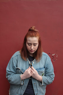
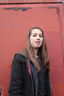
When it came to taking my photographs for my first draft, I decided to change my plans on using the black walls in the drama studio as my cover stars were wearing quite dark clothing and I felt that it would have been too difficult to pull the background out to put on my magazine. Instead I chose to use a wall outside of school that was painted a smooth red which correlated with my house style (for photos that I kept the background in) and was easy to crop out if need be. Furthermore, this location offered me with a large amount of natural light meaning that I did not need to use flash or use too an ISO that would cause too much noise making the photo unusable.


Here are my photographs:


Wednesday 4 January 2017

Drafting and Planning: Double Page Spread Draft v1

The following is the first version of the Double page spread for my music magazine. Currently I have not taken any original photography for my magazine and so I have used a place holder where imagery will be. This draft is representative of my final product. 


As you can see above, I have taken a large amount of inspiration from Rock Sound’s design for their double page spreads. In Rock Sound, they tend to do multiple Double Page Spreads about one artist/band. Because of this they have one double page spread that is almost an “Introduction” to the feature. On this page, there is one bar of text (as you can see on the right side of the page) that “sets the scene” if you will, they then go into much more detail in the following Double Page Spreads.

I have chosen a theme of white, black, the magazine’s house colours (redish) and *Blue*. *Blue* represents any colour that will create symbiosis between the artist and the magazine, for example, if the artist has a blue shirt on, I will use blue. I have chosen to use white backgrounds to my text boxes to give the text clarity over the main imagery that I will use.

In the bottom, left corner of the double page, I have included a pull quote, the positioning of this is not solid, when I have taken my photography and imported it into PagePlus I will decide a more permanent position for it.
As you can see, I have used a place holder where my main image will be, my main image will cover the entire double page spread, but will be set to the back – because of this I will need to take this into consideration when taking my photographs.

My page numbering is evens on the left and odds on the right, as though page one is the contents page. I have ensured that these page numbers are identical to the page numbers I have provided on the contents page, this gives the reader consistency.

*Currently, my article is incomplete, this will be added in once it is complete*

Tuesday 3 January 2017

Drafting and Planning: Contents Page Draft v1

The following is the first version of the contents page for my music magazine. Currently I have not taken any original photography for my magazine and so I have used a place holder where imagery will be. This draft is representative of my final product. 


As you can see, at the top of the page I have created a title for the contents page. I have decided to use “Inside Outre” as a pun, I feel as though this will create a light-hearted feeling to the magazine as I do not want the magazine to feel too “formal” as it was indicated in my survey that most my target audience prefer informal language within this genre of magazine.

Below the title, I have used a placeholder to signify where an image will be placed once I have completed my original photography. Within the frame of the image, I am including the page number in big, bold text. To ensure clarity, I have made this page number red to match the rest of the page numbers on the page.

Below the secondary image, I have included “On the Cover:” to link to the cover page. Below “On the Cover” I have included a brief intro to the double page spread. I have used rhetorical questions that will be answered within the article to get the reader asking questions and therefore causing them to be intrigued.

Down the side of the contents page I have split the contents into 4 sections, “News”, “Featured”, “Regular” and “Album Reviews”. I have done this to mimic what Rock Sound do on their contents pages. However, I have differentiated my contents page by incorporating Rock Sound’s “Exposure” into my “Regulars” section. I have used a black banner and Times New Roman font to ensure that the sections are clearly different and that they stand out above the rest of the content on the page. Furthermore, for the page numbers I have used a red box with white font to create a consistent house style.

Above the table of contents, I have included a small image of the front cover, I saw this on the contents page of Kerrang and liked it. By doing this the reader will have an immediate reference to the cover without having to close the magazine, I feel this will be useful combined with “On the Cover”.

Finally, at the bottom left of the page I have a space for more secondary images/advertisements. I haven’t completely decided what I will be using this space for, but I am thinking about including an image of my double page spread. I could also use this space to advertise albums, e.g. using images of album covers. Furthermore, I could create some posters that will be sold inside my magazine, to act as a pug. 

Monday 2 January 2017

Drafting and Planning: Cover Page Draft v1

The following is the first version of the cover page for my music magazine. Currently I have not taken any original photography for my magazine and so I have used a coloured place holder where imagery will be. This draft is representative of my final product. 


As you can see at the top of the page, there is a skyline which tells the reader what bands are in the magazine, this is designed to inform the reader of the smaller, “less important” bands that feature in the magazine. These bands mentioned in the skyline all feature somewhere on the contents page. For example, Gap Year appear in the “News” section, Lonely Division appears on the “Featured” section and Another January and The Pixies appear in the “Regulars” section as a sub title of “Posters”.

Next, the masthead is in the upper left third. This allows my magazine to be noticeable when stacked on a magazine rack. This will encourage readers who are familiar with the magazine to look for it and therefore increase sales.

My main cover line is made using the font Chanson Heavy SF. I chose this font as it is a loud font that screams for attention, while still bringing clarity to the cover page. I then used my “flagship” font Andre Light SF for my anchorage text. This is the font that I also used for my secondary cover lines and the body of text for my double page spread. I did this to show that the anchorage text isn’t as “important” or as “dominant” as the loud main cover line.

I have included 6 cover lines aside from the main cover line. These cover lines are separated from the main cover line using a red box. The colour red links to the masthead and the hose style of the magazine. These cover lines are set out with the band’s name at the top and a short title of the article.

I have included a bar code, date line and price. The date line is simply “February 17”, this lets the reader know that the magazine is published monthly. I have chosen to price my magazine at £3.00 as it is central to what most people who took my survey said they were willing to pay for a magazine of this genre.