Cover
Page
In the above image I have highlighted the key
features of Terrorizer magazine, issue 275. As you can see, Terrorizer magazine
follows many of the key features of a music magazine in this genre. Terrorizer
magazine is more hard core rock than the other magazines I have analysed,
however I wanted to ensure a good variety of magazines within the alt/rock
genre.
Contents
Page
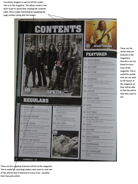
The contents page of Terrorizer has quite a
simplistic design which is effective in what it does. The contents page
includes the regular articles, which appear on many, if not, all issues of
Terrorizer. These are usefully segregated from the other features as returning readers
may prefer to be able to just be able to skip to them without having to read
through the other features.
This contents page also includes secondary imagery
that accompanies the contents tables. These images are paired with page numbers
to help readers navigate to that page.
Double
Page Spread
In the above image I have highlighted the key
features of one of the double page spreads in Terrorizer magazine, issue 217. As
you can see, the main image of the double page spread takes up both pages. This
is because the darkness of the image was placed across both pages and the empty
dark space was used as a background for the body of text. This is effective because
of the white font colour used for the body of text.
The use of anchorage text at the end of the page
acts as a break in the flow of the text and gives the reader a short rest
before continuing reading. This prevents the reader from becoming bored.


No comments:
Post a Comment